Our label design won a Silver A’ Design Award!!
Silver A’ Design Award
We are proud to announce that Basic-Naturals packaging design won an international award. Thanks to our graphic designer Sophia Georgopoulou who worked with us closely to analyze the core of the Basic-Naturals brand back in 2016.
The quality and the look of the Basic-Naturals design represent the quality of our products. All our products are formulated and tested to perfection!
Here are some of the highlights from the article:
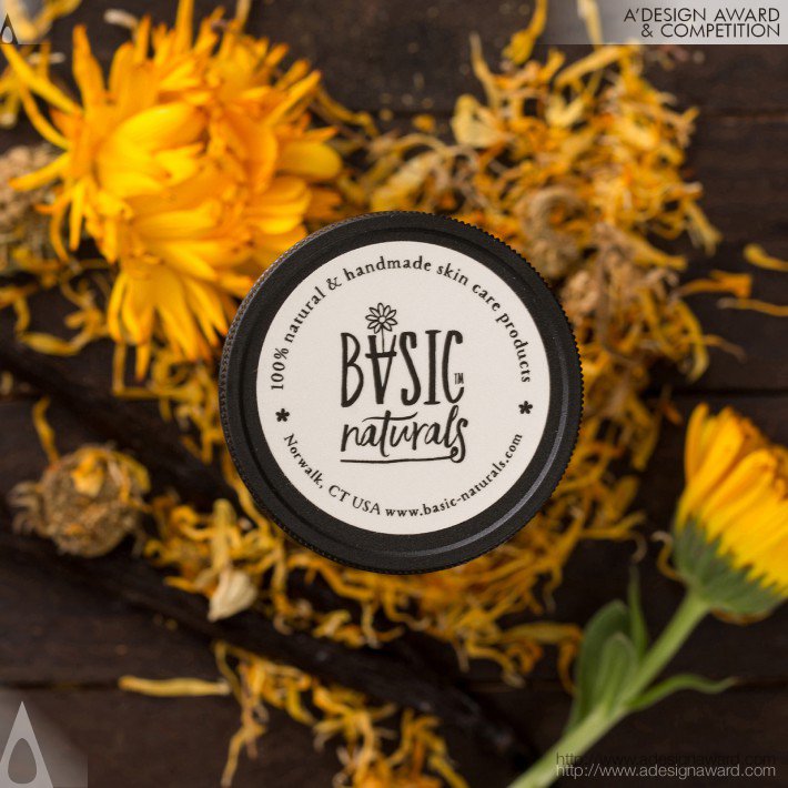
UNIQUE PROPERTIES / PROJECT DESCRIPTION:
The brand’s logo incorporates in the word ‘Basic’ the element of a flower pot in the shape of an inverted ‘A’ and a Calendula flower, constituting a wink to the first product created, based on this plant. The visual identity and label design of the brand had to respect its origins and sufficiently reflect the philosophy behind it. The primary colours are evidently earthly-ochre and black take center stage. The typography employed denotes a handwriting style, while still being clear, simple and very legible. Finally, the design of all individual products integrates an original illustration that relates directly to what the product is and does.
PROJECT DURATION:
This project started in May 2016 and the first batch of products were finalized in March 2017. The project is still ongoing with new label designs for new products.
Read more here – Competition Adesignaward
Basic-Naturals logo design. Silver A’ Design Award